Glow Cards
Interactive CSS-only glow effect cards that track the pointer position using custom properties.
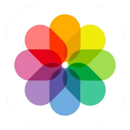
How did I implement the component? The glow is a scaled-up copy of the icon rendered behind the sharp foreground one, blurred with CSS filter: blur() and spring-tracked to the pointer via Motion useSpring. The border is a backdrop-filter overlay masked to the border strip with mask-composite: exclude, so it amplifies whatever color sits behind it.
Move your cursor over the cards:

The component implementation
'use client';

import { useEffect, useRef } from 'react';
import { motion, useSpring } from 'motion/react';

const springConfig = { stiffness: 150, damping: 20 };

function GlowCard({ children, containerRef }) {
  const cardRef = useRef(null);
  const springX = useSpring(0, springConfig);
  const springY = useSpring(0, springConfig);

  useEffect(() => {
    const container = containerRef.current;
    if (!container) return;

    const handlePointerMove = (e) => {
      const rect = cardRef.current?.getBoundingClientRect();
      if (!rect) return;
      springX.set(e.clientX - rect.left - rect.width / 2);
      springY.set(e.clientY - rect.top - rect.height / 2);
    };

    container.addEventListener('pointermove', handlePointerMove);
    return () => container.removeEventListener('pointermove', handlePointerMove);
  }, [containerRef, springX, springY]);

  return (
    <article
      ref={cardRef}
      className="relative w-[300px] aspect-[4/3] rounded-xl outline-2 outline-white/14 bg-white/7"
    >
      <div
        className="absolute inset-0 rounded-xl overflow-hidden grid place-items-center"
      >
        <motion.div
          className="absolute inset-0 grid place-items-center scale-[3.4] opacity-25 blur-xl brightness-125 saturate-200"
          style={{
            x: springX,
            y: springY,
          }}
        >
          <div className="w-[100px]">{children}</div>
        </motion.div>

        <div className="relative z-[2] w-[100px]">{children}</div>
      </div>

      <div
        className="absolute inset-0 rounded-xl pointer-events-none z-[2]"
        style={{
          border: '3px solid transparent',
          backdropFilter: 'saturate(4.2) brightness(2.5) contrast(2.5)',
          mask:
            'linear-gradient(#fff 0 100%) border-box,' +
            'linear-gradient(#fff 0 100%) padding-box',
          maskComposite: 'exclude',
          WebkitMaskComposite: 'xor',
          transform: 'translateZ(0)',
        }}
      />
    </article>
  );
}

export function GlowCards() {
  const containerRef = useRef(null);
  return (
    <div
      ref={containerRef}
      className="flex gap-8 flex-wrap justify-center py-16"
    >
      <GlowCard containerRef={containerRef}>
        {/* your icon */}
      </GlowCard>
    </div>
  );
}
The glowing border
The border isn't a regular border-color. It's a transparent-bordered overlay with backdrop-filter that amplifies whatever is behind it. The trick is mask-composite: exclude - two identical masks, one on border-box and one on padding-box, subtracted from each other. The result: only the border area is visible.
border: 3px solid transparent;
backdrop-filter: saturate(4.2) brightness(2.5) contrast(2.5);

mask: linear-gradient(#fff 0 100%) border-box,
       linear-gradient(#fff 0 100%) padding-box;
mask-composite: exclude;
As the blurred icon moves behind the border, the backdrop-filter picks up the color and apply all filters on it.transform: translateZ(0) forces GPU promotion on the overlay so Safari composites the masked backdrop correctly without bleeding into the corners.
Newsletter
Stay updated with my latest articles and projects. No spam, no nonsense.